Kibana Vega Visualizations: Sankey
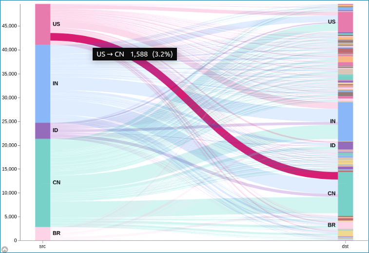
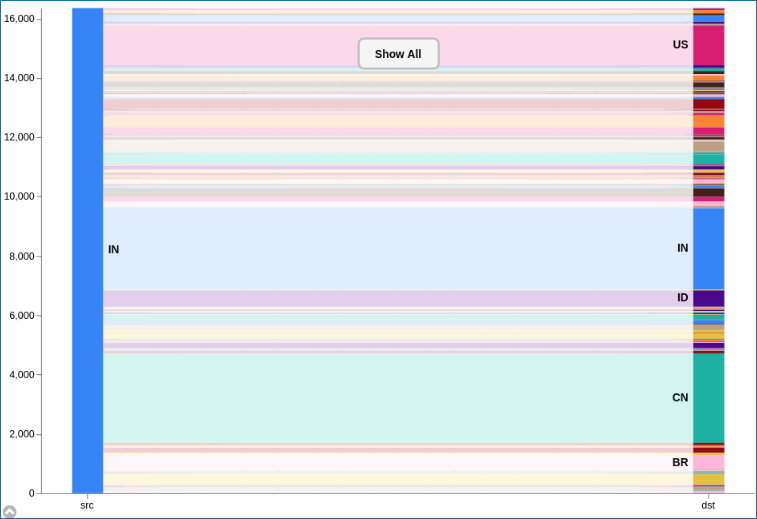
Continuing the series on building custom Vega graphs in Kibana, our today’s topic is a simple two level Sankey graph to show network traffic patterns. Each entry in the sample data has source and destination country code. The graph will have two modes: all-to-all (default), plus it will allow users to select either the source or the destination country, and show only related traffic.


Prerequisites
- Download Elasticsearch 6.2 or later
- Unzip and run
bin/elasticsearch - Download Kibana 6.2 or later (same version as Elasticsearch)
- Unzip and run
bin/kibana - Use makelogs utility to generate sample data. Install it with
npm install -g makelogs, run withmakelogs. You may want to generate bigger dataset with a-c 100kparameter. This assumes you already have NPM. Don’t do this on a production cluster! - Navigate to http://localhost:5601/
- On Management tab (last icon on the left), create a new index pattern: enter
logstash-*for the index pattern, click Next step, choose@timestampfor the time filter, click Create index pattern. - Test that everything works by using Discover tab, setting the time filter in the upper right corner to the last 1 hour, and observe randomly generated data.
Data
For this example, I will use geo.src (as first stack) and geo.dest (as the second stack) fields from the random data generated by the makelogs utility. The fields represent traffic’s source and destination. This query would aggregate by both fields using ES composite aggregation, and counting the number of documents for each combination and returning first 10.
GET logstash-*/_search
{
  "size": 0,
  "aggs": {
    "table": {
      "composite": {
        "size": 10,
        "sources": [
          {"stk1": {"terms": {"field": "geo.src"}}},
          {"stk2": {"terms": {"field": "geo.dest"}}}
        ]
      }
    }
  }
}
Try running this query in the Dev Tools tab - you should see something like:
{
  // ... skipping some meta information ...
  "aggregations": {
    "table": {
      "buckets": [
        {
          "key": {
            "stk1": "AE",
            "stk2": "AR"
          },
          "doc_count": 1
        },
        {
          "key": {
            "stk1": "AE",
            "stk2": "BD"
          },
          "doc_count": 2
        },
        // ... 8 more objects
    ]
  }
}
Visualization Strategy
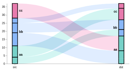
We can think of the sankey graph as having nodes organized into stacks, and edges connecting the nodes. For this graph we only have two stacks - the source and the destination. The two stacks are drawn as vertical bars, one on each side of the screen. Each stack has countries stacked one on top of the other. Each country consists of nodes - portions of the source country that are connected with the nodes in the destination country.

We need to have several data tables to draw the above graph:
- nodes - this table will not be used for drawing directly, but it will be used as the data source for the other tables. We can visualize nodes as black boxes in the picture above - we have 12 of them here. Each node consists of the document count it represents, the stack ID, the country code, and position within the stack (
y0toy1). Note that this table doesn’t have any “screen” coordinates, just the source data. Even stack position is expressed in terms of document counts. First node would go0..n1-1, second would ben1..n2-1, etc. Also, since we have two stacks, there would be two of the first, second, … nodes, one for each stack. - edges - a list of lines (6 in this case), each connecting a node on the left and the right sides. The line will need a pair of (x, y) coordinates, line thickness (strikeWidth), and line color (same as source node). This table is generated by taking all
stack=="stk1"rows from the nodes table, and looking up the corresponding node for the destination stack. A linkpath transform generates the SVG path string describing the curved line. - groups - each group combines all of the nodes for the same country for the same stack. In this graph we have 6 groups, 3 on each side. Each group needs to have a stack ID (stk1 or stk2), the starting and the ending Y value (y0 and y1, similar to the nodes table), and the country code. This table also gets generated from the nodes table, grouping it by stack ID and country code, and stacking it similar to nodes. The y values will align with the nodes table because we sort both tables on the same values.
In addition to the tables, I use three scales to project from “data coordinate space” into the “screen coordinate space”. The “x” scale determines the location of stk1 and stk2 stacks on the screen. The “y” scale maps graph height to the total height of all nodes in the tallest stack (in our case both stacks have the same height). Lastly, the “color” scale assign a color to each country.
The last step is to convert data tables to visuals using three marks: the path mark for edges, rect mark for the stacks, and the text mark for country labels.
Interactions
At this point you will see the expected graph, but often you may want to define how users can interact with the graph. This is done with signals - dynamic variables that change their value based on events, and can be used in various expressions.
When user clicks on a country group in the source stack, the graph needs to hide all data that is not from the clicked country. Similarly, it should work when clicking the destination side. This is done by defining a groupSelector signal. When groupMark is clicked, the signal is set to the country code as either the source or destination. Nodes table is automatically filtered based on the signal value, and the graph is redrawn as if no other data exists. To go back, I show a rectangle box in the middle with a text mark. Clicking the box resets the signal, thus restoring nodes table to the full list.
Another interaction is “mouseover” on countries in the stacks. On groupMark mouseover event, groupHover signal is set similar to the groupSelector. The signal is used in controlling transparency of the edge lines.
Debugging and Exploring
Understanding Vega code could be challenging at times. Luckly, you can access Vega internal state at any moment using browser debugging tools (F11 on Win & Linux). Use console to see table content, e.g. console.table(VEGA_DEBUG.view.data('edges')) or the state of a signal with VEGA_DEBUG.view.signal('height'). You can even view scale internal values with VEGA_DEBUG.view._runtime.scales.y.
Vega code
See code comments for explanation of what each line does, or read the vega documentation. Note that this code uses HJSON, a more readable form of JSON.
{
  $schema: https://vega.github.io/schema/vega/v3.0.json
  data: [
    {
      // query ES based on the currently selected time range and filter string
      name: rawData
      url: {
        %context%: true
        %timefield%: @timestamp
        index: logstash-*
        body: {
          size: 0
          aggs: {
            table: {
              composite: {
                size: 10000
                sources: [
                  {
                    stk1: {
                      terms: {field: "geo.src"}
                    }
                  }
                  {
                    stk2: {
                      terms: {field: "geo.dest"}
                    }
                  }
                ]
              }
            }
          }
        }
      }
      // From the result, take just the data we are interested in
      format: {property: "aggregations.table.buckets"}
      // Convert key.stk1 -> stk1 for simpler access below
      transform: [
        {type: "formula", expr: "datum.key.stk1", as: "stk1"}
        {type: "formula", expr: "datum.key.stk2", as: "stk2"}
        {type: "formula", expr: "datum.doc_count", as: "size"}
      ]
    }
    {
      name: nodes
      source: rawData
      transform: [
        // when a country is selected, filter out unrelated data
        {
          type: filter
          expr: !groupSelector || groupSelector.stk1 == datum.stk1 || groupSelector.stk2 == datum.stk2
        }
        // Set new key for later lookups - identifies each node
        {type: "formula", expr: "datum.stk1+datum.stk2", as: "key"}
        // instead of each table row, create two new rows,
        // one for the source (stack=stk1) and one for destination node (stack=stk2).
        // The country code stored in stk1 and stk2 fields is placed into grpId field.
        {
          type: fold
          fields: ["stk1", "stk2"]
          as: ["stack", "grpId"]
        }
        // Create a sortkey, different for stk1 and stk2 stacks.
        // Space separator ensures proper sort order in some corner cases.
        {
          type: formula
          expr: datum.stack == 'stk1' ? datum.stk1+' '+datum.stk2 : datum.stk2+' '+datum.stk1
          as: sortField
        }
        // Calculate y0 and y1 positions for stacking nodes one on top of the other,
        // independently for each stack, and ensuring they are in the proper order,
        // alphabetical from the top (reversed on the y axis)
        {
          type: stack
          groupby: ["stack"]
          sort: {field: "sortField", order: "descending"}
          field: size
        }
        // calculate vertical center point for each node, used to draw edges
        {type: "formula", expr: "(datum.y0+datum.y1)/2", as: "yc"}
      ]
    }
    {
      name: groups
      source: nodes
      transform: [
        // combine all nodes into country groups, summing up the doc counts
        {
          type: aggregate
          groupby: ["stack", "grpId"]
          fields: ["size"]
          ops: ["sum"]
          as: ["total"]
        }
        // re-calculate the stacking y0,y1 values
        {
          type: stack
          groupby: ["stack"]
          sort: {field: "grpId", order: "descending"}
          field: total
        }
        // project y0 and y1 values to screen coordinates
        // doing it once here instead of doing it several times in marks
        {type: "formula", expr: "scale('y', datum.y0)", as: "scaledY0"}
        {type: "formula", expr: "scale('y', datum.y1)", as: "scaledY1"}
        // boolean flag if the label should be on the right of the stack
        {type: "formula", expr: "datum.stack == 'stk1'", as: "rightLabel"}
        // Calculate traffic percentage for this country using "y" scale
        // domain upper bound, which represents the total traffic
        {
          type: formula
          expr: datum.total/domain('y')[1]
          as: percentage
        }
      ]
    }
    {
      // This is a temp lookup table with all the 'stk2' stack nodes
      name: destinationNodes
      source: nodes
      transform: [
        {type: "filter", expr: "datum.stack == 'stk2'"}
      ]
    }
    {
      name: edges
      source: nodes
      transform: [
        // we only want nodes from the left stack
        {type: "filter", expr: "datum.stack == 'stk1'"}
        // find corresponding node from the right stack, keep it as "target"
        {
          type: lookup
          from: destinationNodes
          key: key
          fields: ["key"]
          as: ["target"]
        }
        // calculate SVG link path between stk1 and stk2 stacks for the node pair
        {
          type: linkpath
          orient: horizontal
          shape: diagonal
          sourceY: {expr: "scale('y', datum.yc)"}
          sourceX: {expr: "scale('x', 'stk1') + bandwidth('x')"}
          targetY: {expr: "scale('y', datum.target.yc)"}
          targetX: {expr: "scale('x', 'stk2')"}
        }
        // A little trick to calculate the thickness of the line.
        // The value needs to be the same as the hight of the node, but scaling
        // size to screen's height gives inversed value because screen's Y
        // coordinate goes from the top to the bottom, whereas the graph's Y=0
        // is at the bottom. So subtracting scaled doc count from screen height
        // (which is the "lower" bound of the "y" scale) gives us the right value
        {
          type: formula
          expr: range('y')[0]-scale('y', datum.size)
          as: strokeWidth
        }
        // Tooltip needs individual link's percentage of all traffic
        {
          type: formula
          expr: datum.size/domain('y')[1]
          as: percentage
        }
      ]
    }
  ]
  scales: [
    {
      // calculates horizontal stack positioning
      name: x
      type: band
      range: width
      domain: ["stk1", "stk2"]
      paddingOuter: 0.05
      paddingInner: 0.95
    }
    {
      // this scale goes up as high as the highest y1 value of all nodes
      name: y
      type: linear
      range: height
      domain: {data: "nodes", field: "y1"}
    }
    {
      // use rawData to ensure the colors stay the same when clicking.
      name: color
      type: ordinal
      range: category
      domain: {data: "rawData", field: "stk1"}
    }
    {
      // this scale is used to map internal ids (stk1, stk2) to stack names
      name: stackNames
      type: ordinal
      range: ["Source", "Destination"]
      domain: ["stk1", "stk2"]
    }
  ]
  axes: [
    {
      // x axis should use custom label formatting to print proper stack names
      orient: bottom
      scale: x
      encode: {
        labels: {
          update: {
            text: {scale: "stackNames", field: "value"}
          }
        }
      }
    }
    {orient: "left", scale: "y"}
  ]
  marks: [
    {
      // draw the connecting line between stacks
      type: path
      name: edgeMark
      from: {data: "edges"}
      // this prevents some autosizing issues with large strokeWidth for paths
      clip: true
      encode: {
        update: {
          // By default use color of the left node, except when showing traffic
          // from just one country, in which case use destination color.
          stroke: [
            {
              test: groupSelector && groupSelector.stack=='stk1'
              scale: color
              field: stk2
            }
            {scale: "color", field: "stk1"}
          ]
          strokeWidth: {field: "strokeWidth"}
          path: {field: "path"}
          // when showing all traffic, and hovering over a country,
          // highlight the traffic from that country.
          strokeOpacity: {
            signal: !groupSelector && (groupHover.stk1 == datum.stk1 || groupHover.stk2 == datum.stk2) ? 0.9 : 0.3
          }
          // Ensure that the hover-selected edges show on top
          zindex: {
            signal: !groupSelector && (groupHover.stk1 == datum.stk1 || groupHover.stk2 == datum.stk2) ? 1 : 0
          }
          // format tooltip string
          tooltip: {
            signal: datum.stk1 + ' → ' + datum.stk2 + '    ' + format(datum.size, ',.0f') + '   (' + format(datum.percentage, '.1%') + ')'
          }
        }
        // Simple mouseover highlighting of a single line
        hover: {
          strokeOpacity: {value: 1}
        }
      }
    }
    {
      // draw stack groups (countries)
      type: rect
      name: groupMark
      from: {data: "groups"}
      encode: {
        enter: {
          fill: {scale: "color", field: "grpId"}
          width: {scale: "x", band: 1}
        }
        update: {
          x: {scale: "x", field: "stack"}
          y: {field: "scaledY0"}
          y2: {field: "scaledY1"}
          fillOpacity: {value: 0.6}
          tooltip: {
            signal: datum.grpId + '   ' + format(datum.total, ',.0f') + '   (' + format(datum.percentage, '.1%') + ')'
          }
        }
        hover: {
          fillOpacity: {value: 1}
        }
      }
    }
    {
      // draw country code labels on the inner side of the stack
      type: text
      from: {data: "groups"}
      // don't process events for the labels - otherwise line mouseover is unclean
      interactive: false
      encode: {
        update: {
          // depending on which stack it is, position x with some padding
          x: {
            signal: scale('x', datum.stack) + (datum.rightLabel ? bandwidth('x') + 8 : -8)
          }
          // middle of the group
          yc: {signal: "(datum.scaledY0 + datum.scaledY1)/2"}
          align: {signal: "datum.rightLabel ? 'left' : 'right'"}
          baseline: {value: "middle"}
          fontWeight: {value: "bold"}
          // only show text label if the group's height is large enough
          text: {signal: "abs(datum.scaledY0-datum.scaledY1) > 13 ? datum.grpId : ''"}
        }
      }
    }
    {
      // Create a "show all" button. Shown only when a country is selected.
      type: group
      data: [
        // We need to make the button show only when groupSelector signal is true.
        // Each mark is drawn as many times as there are elements in the backing data.
        // Which means that if values list is empty, it will not be drawn.
        // Here I create a data source with one empty object, and filter that list
        // based on the signal value. This can only be done in a group.
        {
          name: dataForShowAll
          values: [{}]
          transform: [{type: "filter", expr: "groupSelector"}]
        }
      ]
      // Set button size and positioning
      encode: {
        enter: {
          xc: {signal: "width/2"}
          y: {value: 30}
          width: {value: 80}
          height: {value: 30}
        }
      }
      marks: [
        {
          // This group is shown as a button with rounded corners.
          type: group
          // mark name allows signal capturing
          name: groupReset
          // Only shows button if dataForShowAll has values.
          from: {data: "dataForShowAll"}
          encode: {
            enter: {
              cornerRadius: {value: 6}
              fill: {value: "#f5f5f5"}
              stroke: {value: "#c1c1c1"}
              strokeWidth: {value: 2}
              // use parent group's size
              height: {
                field: {group: "height"}
              }
              width: {
                field: {group: "width"}
              }
            }
            update: {
              // groups are transparent by default
              opacity: {value: 1}
            }
            hover: {
              opacity: {value: 0.7}
            }
          }
          marks: [
            {
              type: text
              // if true, it will prevent clicking on the button when over text.
              interactive: false
              encode: {
                enter: {
                  // center text in the paren group
                  xc: {
                    field: {group: "width"}
                    mult: 0.5
                  }
                  yc: {
                    field: {group: "height"}
                    mult: 0.5
                    offset: 2
                  }
                  align: {value: "center"}
                  baseline: {value: "middle"}
                  fontWeight: {value: "bold"}
                  text: {value: "Show All"}
                }
              }
            }
          ]
        }
      ]
    }
  ]
  signals: [
    {
      // used to highlight traffic to/from the same country
      name: groupHover
      value: {}
      on: [
        {
          events: @groupMark:mouseover
          update: "{stk1:datum.stack=='stk1' && datum.grpId, stk2:datum.stack=='stk2' && datum.grpId}"
        }
        {events: "mouseout", update: "{}"}
      ]
    }
    // used to filter only the data related to the selected country
    {
      name: groupSelector
      value: false
      on: [
        {
          // Clicking groupMark sets this signal to the filter values
          events: @groupMark:click!
          update: "{stack:datum.stack, stk1:datum.stack=='stk1' && datum.grpId, stk2:datum.stack=='stk2' && datum.grpId}"
        }
        {
          // Clicking "show all" button, or double-clicking anywhere resets it
          events: [
            {type: "click", markname: "groupReset"}
            {type: "dblclick"}
          ]
          update: "false"
        }
      ]
    }
  ]
}
Highlighting components
To highlight components of the stacks and generate the above explanation image, replace url section with these hardcoded values, and add an additional mark after all other marks.
values: {
  aggregations: { table: { buckets: [
    {key: {stk1:"aa", stk2:"cc"}, doc_count: 7}
    {key: {stk1:"aa", stk2:"bb"}, doc_count: 4}
    {key: {stk1:"bb", stk2:"aa"}, doc_count: 8}
    {key: {stk1:"bb", stk2:"bb"}, doc_count: 6}
    {key: {stk1:"bb", stk2:"cc"}, doc_count: 3}
    {key: {stk1:"cc", stk2:"aa"}, doc_count: 9}
]}}}
{
  type: rect
  from: {data: "nodes"}
  encode: {
    enter: {
      stroke: {value: "#000"}
      strokeWidth: {value: 2}
      width: {scale: "x", band: 1}
      x: {scale: "x", field: "stack"}
      y: {field: "y0", scale: "y"}
      y2: {field: "y1", scale: "y"}
    }
  }
}