Tutorial: Getting Started with Vega
Vega declarative grammar is a powerful way to visualize your data. Let’s learn Vega language with a few simple examples.
Open Vega editor - a convenient tool to experiment with the raw Vega (it has no ElasticSearch customizations). Copy this code. You should see “Hello Vega!” text in the right panel.

{
  "$schema": "https://vega.github.io/schema/vega/v3.json",
  "width": 100, "height": 30,
  "background": "#eef2e8",
  "padding": 5,
  "marks": [
    {
      "type": "text",
      "encode": {
        "enter": {
          "text":     { "value": "Hello Vega!" },
          "align":    { "value": "center"},
          "baseline": { "value": "middle"},
          "stroke":   { "value": "#A32299" },
          "angle":    { "value": 15 },
          "x":        { "signal": "width/2" },
          "y":        { "signal": "height/2" }
        }
      }
    }
  ]
}
The marks block is an array of drawing primitives, such as text, lines, and rectangles. Each mark has a large number of parameters specified inside the encoding set. Each parameter is set to either a constant (value) or a result of a computation (signal) in the “enter” stage. For the text mark, we specify the text string, make sure text is properly positioned relative to given coordinates, rotated, and set text color. The x and y coordinates are computed based on the width and height of the graph, positioning the text in the middle. There are many other text mark parameters. There is also an interactive text mark demo graph to try different parameter values.
The $schema is simply an ID of the required Vega engine version. Background makes the graph non-transparent. The width and height set the initial drawing canvas size. The final graph size may change in some cases, based on the content and autosizing options. Note that Kibana’s default autosize is fit instead of pad, thus making height and width optional. The padding parameter adds some space around the graph in addition to the width and height.
Data-driven graph
Our next step is to draw a data-driven graph using the rectangle mark. The data section allows multiple data sources, either hardcoded, or as a URL. In Kibana, you may also use direct Elasticsearch queries. Our vals data table has 4 rows and two columns - category and count. We use category to position the bar on the x axis, and count for the bar’s height. Note that 0 for they coordinate is at the top, and increases downwards.

{
  "$schema":"https://vega.github.io/schema/vega/v3.json",
  "width": 300, "height": 100,
  "data": [ {
    "name": "vals",
    "values": [
      {"category": 50,  "count": 30},
      {"category": 100, "count": 80},
      {"category": 150, "count": 10},
      {"category": 200, "count": 50}
    ]
  } ],
  "marks": [ {
    "type": "rect",
    "from": { "data": "vals" },
    "encode": {
      "enter": {
        "x":     {"field": "category"},
        "width": {"value": 30},
        "y":     {"field": "count"},
        "y2":    {"value": 0}
      }
    }
  } ]
}
The rect mark specifies vals as the source of data. The mark is drawn once per source data value (also known as a table row or a datum). Unlike the previous graph, the x and y parameters are not hardcoded, but come from the fields of the datum.
Scaling
Scaling is one of the most important, but somewhat tricky concepts in Vega. In the previous examples, screen pixel coordinates were hardcoded in the data. While it made things simpler, the real data almost never comes in that form. Instead, the source data comes in its own units (e.g. number of events), and it is up to the graph to scale source values to the desired graph size in pixels.
In this example, we use linear scale – essentially a mathematical function to convert a value from the domain of the source data (in this graph count values of 1000..8000, and including count=0), to the desired range (in our case the height of the graph is 0..99). Adding "scale": "yscale" to both y and y2 parameter uses yscale scaler to convert count to screen coordinates (0 becomes 99, and 8000 - largest value in the source data - to becomes 0). Note that the height range parameter is a special case, flipping the value to make 0 appear at the bottom of the graph.

{
  "$schema":"https://vega.github.io/schema/vega/v3.json",
  "width": 400, "height": 100,
  "data": [ {
    "name": "vals",
    "values": [
      {"category": 50,  "count": 3000},
      {"category": 100, "count": 8000},
      {"category": 150, "count": 1000},
      {"category": 200, "count": 5000}
    ]
  } ],
 "scales": [
    {
      "name": "yscale",
      "type": "linear",
      "zero": true,
      "domain": {"data": "vals", "field": "count"},
      "range": "height"
    }
  ],
  "marks": [ {
    "type": "rect",
    "from": { "data": "vals" },
    "encode": {
      "enter": {
        "x":     {"field": "category"},
        "width": {"value": 30},
        "y":     {"scale": "yscale", "field": "count"},
        "y2":    {"scale": "yscale", "value": 0}
      }
    }
  } ]
}
Band scaling
For our tutorial we will need another one of 15+ Vega scale types - a band scale. This scale is used when we have a set of values (like categories), that need to be represented as bands, each occupying same proportional width of the graph’s total width. Here, the band scale gives each one of the 4 unique categories the same proportional width (about 400/4, minus 5% padding between bars and on both ends). The {"scale": "xscale", "band": 1} gets the 100% of the band’s width for the mark’s width parameter.

{
  "$schema":"https://vega.github.io/schema/vega/v3.json",
  "width": 400, "height": 100,
  "data": [ {
    "name": "vals",
    "values": [
      {"category": "Oranges", "count": 3000},
      {"category": "Pears",   "count": 8000},
      {"category": "Apples",  "count": 1000},
      {"category": "Peaches", "count": 5000}
    ]
  } ],
 "scales": [
    {
      "name": "yscale",
      "type": "linear",
      "zero": true,
      "domain": {"data": "vals", "field": "count"},
      "range": "height"
    },
    {
      "name": "xscale",
      "type": "band",
      "domain": {"data": "vals", "field": "category"},
      "range": "width",
      "padding": 0.05
    }
  ],
  "marks": [ {
    "type": "rect",
    "from": { "data": "vals" },
    "encode": {
      "enter": {
        "x":     {"scale": "xscale", "field": "category"},
        "width": {"scale": "xscale", "band": 1},
        "y":     {"scale": "yscale", "field": "count"},
        "y2":    {"scale": "yscale", "value": 0}
      }
    }
  } ]
}
Axes
A typical graph wouldn’t be complete without the axis labels. The axis definition uses the same scales we defined earlier, so adding them is as simple as referencing the scale by its name, and specifying the placement side. Add this code as the top-level element to the last code example.

  "axes": [
    {"scale": "yscale", "orient": "left"},
    {"scale": "xscale", "orient": "bottom"}
  ],
Note that the total graph size has increased automatically to accommodate these axes. The graph can be forced to stay in the original size by adding "autosize": "fit" at the top of the specification.
Data Transformations and Conditionals
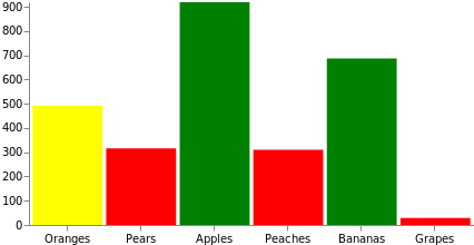
Data often needs additional manipulation before it can be used for drawing. Vega provides numerous transformations to help with that. Let’s use the most common formula transformation to dynamically add a random count value field to each of the source datums. Also, in this graph we will manipulate the fill color of the bar, making it red if the value is less than 333, yellow if the values less than 666, and green if the value is above 666. Note that this could have been done with a scale instead, mapping domain of the source data to the set of colors, or to a color scheme.

{
  "$schema":"https://vega.github.io/schema/vega/v3.json",
  "width": 400, "height": 200,
  "data": [ {
    "name": "vals",
    "values": [
      {"category": "Oranges"},
      {"category": "Pears"},
      {"category": "Apples"},
      {"category": "Peaches"},
      {"category": "Bananas"},
      {"category": "Grapes"}
    ],
    "transform": [
      {"type": "formula", "as": "count", "expr": "random()*1000"}
    ]
  } ],
 "scales": [
    {
      "name": "yscale",
      "type": "linear",
      "zero": true,
      "domain": {"data": "vals", "field": "count"},
      "range": "height"
    },
    {
      "name": "xscale",
      "type": "band",
      "domain": {"data": "vals", "field": "category"},
      "range": "width",
      "padding": 0.05
    }
  ],
  "axes": [
    {"scale": "yscale", "orient": "left"},
    {"scale": "xscale", "orient": "bottom"}
  ],
  "marks": [ {
    "type": "rect",
    "from": { "data": "vals" },
    "encode": {
      "enter": {
        "x":     {"scale": "xscale", "field": "category"},
        "width": {"scale": "xscale", "band": 1},
        "y":     {"scale": "yscale", "field": "count"},
        "y2":    {"scale": "yscale", "value": 0},
        "fill":  [
          {"test": "datum.count < 333", "value": "red"},
          {"test": "datum.count < 666", "value": "yellow"},
          {"value": "green"}
        ]
      }
    }
  } ]
}
Dynamic Data with Elasticsearch and Kibana
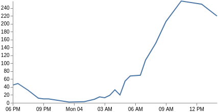
Now that you know the basics, let’s try to create a time-based line chart using some randomly generated Elasticsearch data. This is similar to what you initially see when creating a new Vega graph in Kibana, except that it will use Vega language instead of Vega-Lite. For this example we will hardcode the data using values, instead of doing the real query with url. This way we can continue testing in the Vega editor that does not support Kibana ES queries. The graph will become fully dynamic inside Kibana if you replace values with the url section as shown below.
Our query counts the number of documents per time interval, using the time range and context filters as selected by the dashboard user. See how to query Elasticsearch from Kibana for more info.
   "url": {
      "%context%": true,
      "%timefield%": "@timestamp",
      "index": "_all",
      "body": {
        "aggs": {
          "time_buckets": {
            "date_histogram": {
              "field": "@timestamp",
              "interval": {"%autointerval%": true},
              "extended_bounds": {
                "min": {"%timefilter%": "min"},
                "max": {"%timefilter%": "max"}
              },
              "min_doc_count": 0
            }
          }
        },
        "size": 0
      }
When we run it, the results will look like this (some unrelated fields were removed for brevity):
     "aggregations": {
        "time_buckets": {
          "buckets": [
            {"key": 1528061400000, "doc_count": 1},
            {"key": 1528063200000, "doc_count": 45},
            {"key": 1528065000000, "doc_count": 49},
            {"key": 1528066800000, "doc_count": 17},
...
As you can see, the real data we need is inside the aggregations.time_buckets.buckets array. We can tell Vega to only look at that array with the "format": {"property": "aggregations.time_buckets.buckets"} inside the data definition.
Our x axis is no longer based on categories, but on time (the key field is a UNIX time that Vega can use directly). Thus, we change the xscale type to time, and adjust all fields to use key and doc_count. We also need to change the mark type to line, and include just x and y parameter channels. Voila, you now have a line graph. You may also be interested in customizing the x axis labels with the format, labelAngle, and tickCount parameters.

{
  "$schema": "https://vega.github.io/schema/vega/v3.json",
  "width": 400, "height": 200,
  "data": [
    {
      "name": "vals",
      "values": {
        "aggregations": {
          "time_buckets": {
            "buckets": [
              {"key": 1528063200000, "doc_count": 45},
              {"key": 1528065000000, "doc_count": 49},
              {"key": 1528068600000, "doc_count": 32},
              {"key": 1528072200000, "doc_count": 12},
              {"key": 1528074000000, "doc_count": 10},
              {"key": 1528075800000, "doc_count": 10},
              {"key": 1528083000000, "doc_count": 2},
              {"key": 1528088400000, "doc_count": 3},
              {"key": 1528092000000, "doc_count": 9},
              {"key": 1528093800000, "doc_count": 15},
              {"key": 1528095600000, "doc_count": 13},
              {"key": 1528097400000, "doc_count": 19},
              {"key": 1528099200000, "doc_count": 33},
              {"key": 1528101000000, "doc_count": 20},
              {"key": 1528102800000, "doc_count": 55},
              {"key": 1528104600000, "doc_count": 68},
              {"key": 1528108200000, "doc_count": 70},
              {"key": 1528110000000, "doc_count": 108},
              {"key": 1528113600000, "doc_count": 151},
              {"key": 1528117200000, "doc_count": 206},
              {"key": 1528122600000, "doc_count": 258},
              {"key": 1528129800000, "doc_count": 250},
              {"key": 1528135200000, "doc_count": 220}
            ]
          }
        }
      },
      "format": {"property": "aggregations.time_buckets.buckets"}
    }
  ],
  "scales": [
    {
      "name": "yscale",
      "type": "linear",
      "zero": true,
      "domain": {"data": "vals", "field": "doc_count"},
      "range": "height"
    },
    {
      "name": "xscale",
      "type": "time",
      "domain": {"data": "vals", "field": "key"},
      "range": "width"
    }
  ],
  "axes": [
    {"scale": "yscale", "orient": "left"},
    {"scale": "xscale", "orient": "bottom"}
  ],
  "marks": [
    {
      "type": "line",
      "from": {"data": "vals"},
      "encode": {
        "enter": {
          "x": {"scale": "xscale", "field": "key"},
          "y": {"scale": "yscale", "field": "doc_count"}
        }
      }
    }
  ]
}